Design first, and the process behind
Why is it important to dedicate enough time to design your app? let me show you how we did it for Conqu, what worked, and what didn't work.
Why is it important to dedicate enough time to design your app? let me show you how we did it for Conqu, what worked, and what didn't work.
Team size and roles
I love small teams. Everybody is so much productive when the team is small. Before this project, I was in a much larger project and the change was like night and day. With a small team, where is no waste of time in long meetings, or trying to decide if feature A is better than feature B, or trying to explain to other people -that are not completely involved- what it is best or fits better in the project.
Being small is bliss, turn-arounds are quick, and in a very agile environment everybody knows what to do and we can move faster. Another thing is that you need a team that has balanced skills in UX and design, which are as important as development skills. We have three team members and each of us plays different roles.
Mark: The designer and artist. He is in charge of doing everything related to colors and pixels. In addition, he is doing some wireframe prototyping and helping us with the video, text copy and html code.
Laura: The server side development and the magic behind the ui. She is in charge of doing all ColdFusion and server side code. But because ColdFusion is so fast to write, she helps the Flex development, in special all the SQLite interaction. She also plays the role of product owner with myself.
Myself: The Flex guy. I'm in charge of doing most of the custom components on Flex and make sure that the app is optimized for mobile.
Tools
We use an internal tool, similar to Basecamp to post all the TODO's, messages and all the design files that we share with the team. Skype and IM for communication and a webdav disk for sharing assets, minimum amount of email (we prefer to have those conversations in the internal tool) and Acrobat.com for sharing documents. And last but not least, Adobe tools for development and design.
Time line
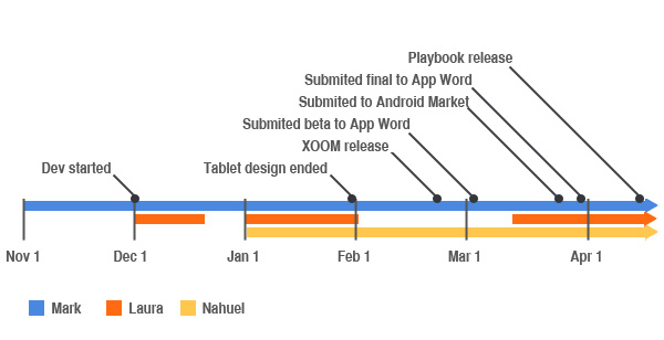
The following is a time line until today. The project is still going on, so maybe I will do another post in the future to show the progress.
Beginning & Exploration (High detailed design vs wireframe prototype)
First month - Nov 1
At this stage, only Mark worked in the project full time. In the first week, we shared ideas and made sure Mark understood what we had in mind, and what the idea behind the product was. We started with the tablet version mostly because we were exited about all the tablets (Playbook and Android) that were announced, and we didn't want to miss the boat again (we missed it for iPhone and iPad). But the true is that we are geeks and we love gadgets, so what better excuse to have a project where we would be using the latest and greatest gadget. Now that I'm looking back, maybe we should have done the Desktop version and then move to the tablets because there are many more people with desktops than tablets at this moment (I think that will soon change).
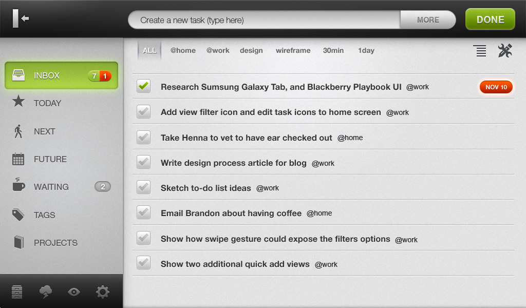
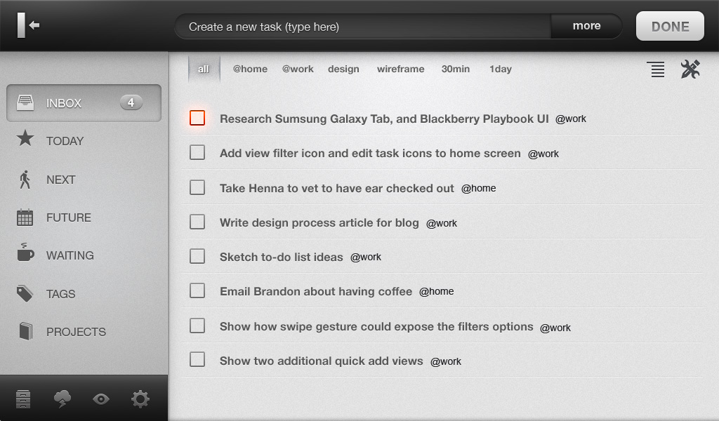
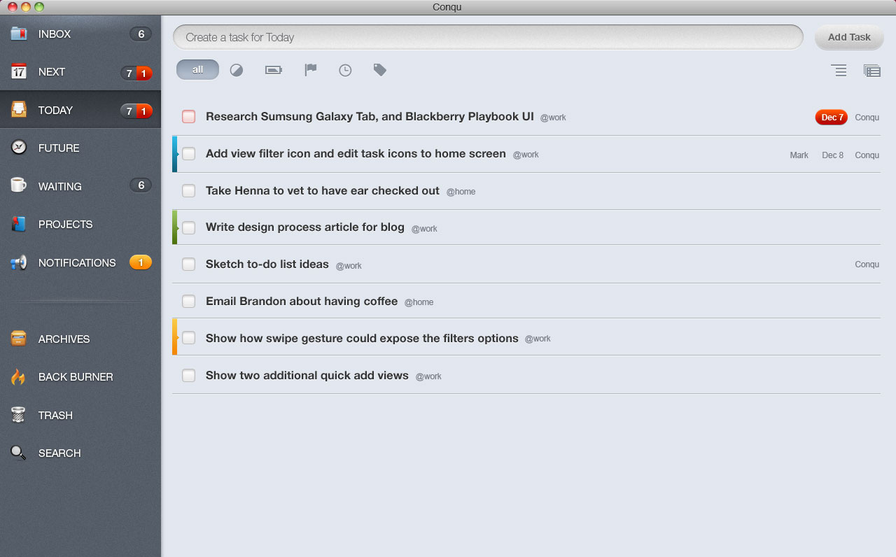
Once Mark understood what we wanted, he started working and by the end of the first week, he has his first mockup.

As you see in this design, he spent a good time in the details. He skipped the wireframe prototype and showed us a much more polished design. That is what we usually do for our clients to make them more excited and it usually works. But this time, we were the clients so we thought that maybe we didn't need that, but we were wrong. Having a more detailed design helped us visualize the final product much better, and I can tell you that one of the best experiences was when we loaded that image in a tablet for the first time. We were like children with a new toy, that image has imprinted the feeling of the experience of the app. If we had just a black and white wireframe the feeling would have been totally different.
He later did some wireframes for other parts of the application, but that process didn't last long as we learnt quickly that having a more detail design triggered more feedback in our brain. That contradicts with some of our processes that we do for clients. We usually spend a lot of time creating great Omnigraffle documents, but for this project, we had 90% of the ideas as detailed as final.
Keep in mind that that worked fine in this project but if you have a bigger team you should think about it. For bigger teams, specially when everybody wants to be the chef in the kitchen it's better to go with more iterations of wireframes until they have an agreement and then move to pixel detail. In addition, working on wireframes for the most part lets the client know that there is no actual work. Sometimes clients would see a prototype and think that we are almost done, and that is far from true.
It wasn't the case for us because the three of us have a good eye for design and UX and we can visualize quickly. We can do the wireframes over the phone in our heads and go directly to a detailed mockup. The other thing is that all of us in the team are picky, we want pixel-perfect design - all the time. Sometimes we would even agree on a wireframe, but once we had it in Photoshop (pixel-perfect), we would make a lot of adjustments. Don't get me wrong, wireframes are good but you need to do them quickly and move on because later you will change them anyway, just don't spend too much on them. That's why we ended up doing more and more final mockups and less wireframes.
The three weeks that followed were an exploration of design, where we played with different ideas until we nailed down what we wanted. Laura and I where playing the role of product owners and Mark was cranking all the designs and the only one really working.
Some of the ideas are shown in the following screen shoots, you can click to expand to full size.

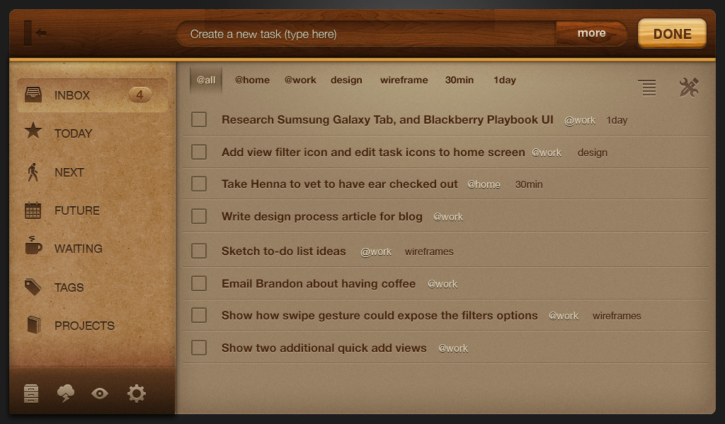
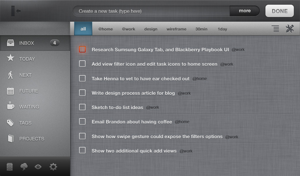
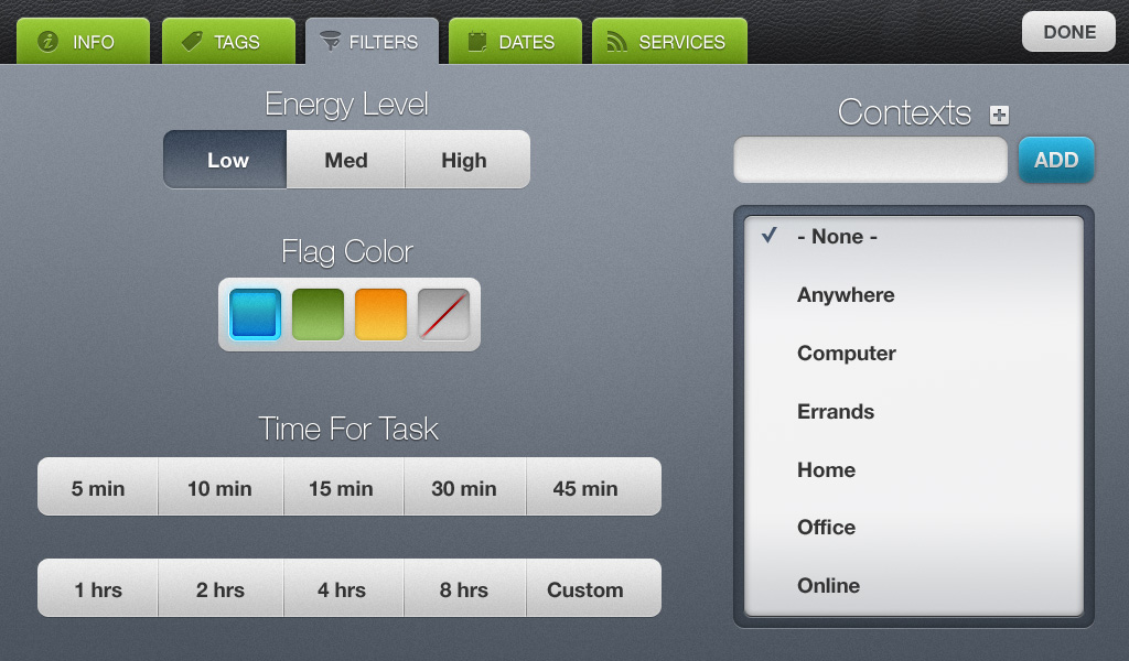
From all those ideas (we have more, but I made a selection for this post) we picked what we thought worked best from each and made a final version. Mark was expecting us to choose the final one and move on. But we, the product owners, were having a hard time making the final selection, each of us were attached to different images. For example, Mark liked the black one but Laura didn't and they both liked the wood version but I didn't. We knew that we needed to get to one that all of us liked and also made sure that we had all the items in place before deciding on the final version. We knew that once we had a final version, we couldn't go back and made big changes because it would affect development badly. After a few more rounds of tweaking we got our final design. You can read more about how we chose the final design in this post.
Development starts and design expands to other areas
Second Month Dec 1
Once we were done with the design exploration, we started development. It was important that at this time we were very happy with the design that we had and we were not thinking about doing major changes in the design nor UX. Laura started working on the first screen but just part time for that month, while Mark continued working full time on the edit screen and the rest of the app. Having Mark shaping other parts of the app, helped us visualizing how the whole app would function. We then started to think about transitions and how all the different pieces would be glued together.
Development now in full speed
Third Month Jan 1
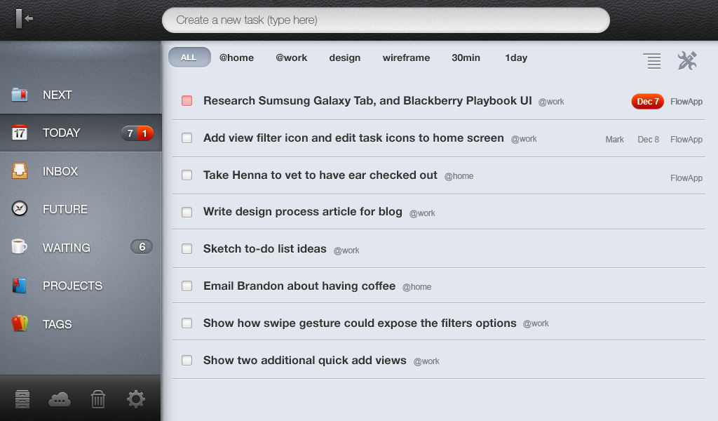
After a relaxing december, we started January at full speed, Laura and I were working on development while Mark was working on final screens of the tablet version. He finished the first iteration of the tablet version on Jan 20th. We later asked him to tweak things here and there but not big changes, mostly usability changes that we started noticing when we were using the app in a real device. We also asked him to add a settings screen that was not in the original design. Other than that, all the major things where done.
Working with all the screens ready was a pleasure. It meant non stop development not only because they were final, but also because we had all the assets ready on our webdav disk, with a picture per screen with the dimensions, fonts, drop shadow, etc that looked like this:

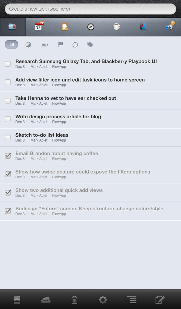
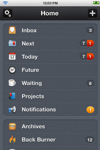
And this is how the vertical version looks
Continue development for tablet, design for phone and desktop were starting to take shape
Fourth Month Feb 1
Laura and I were working on the tablet and from time to time requesting small changes to Mark. Meanwhile, he started the phone version and he managed to do that plus the desktop version and the website. At this point he was multitasking with all the different things that we needed: the website for the launch, a logo, banners, tweaks on the tablet version plus the phone and desktop version. Having Mark available full time working on all this helped us move forward quickly because we always had a designer available for anything such as assets, usability issues fixes, testing and preparing the next round of development for desktop and phone.
Android and Playbook launch
Fifth Month Mar 1
We did a first launch with a Playbook version, but it was not ready for prime time. We knew it but we did it because nobody could use it anyway since the Playbook was not available at that moment. People were saying that RIM was taking a lot of time to approve the apps and we wanted to make sure that we had something on the Blackberry market as soon as possible.
Later on March 23rd, we launched the Android version for everybody to use. That was our first real milestone. A week later we updated the build for the playbook. So the whole month we worked on making an stable build with all the features that we wanted. Laura and Mark worked on submitting the apps to the different markets and preparing the images, logos, etc for each while Mark was also supporting us in the development.
Synchronization and Desktop version
Sixth Month April 1
April is not done yet as I'm writing this post, but most of the moth was spent in the synchronization and task sharing. Laura is taking care of all the ColdFusion code while I'm doing the ui. I'm done with my part and about to start the desktop version, will see how that works.
Interesting facts by numbers
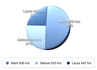
Hours spent on the project
We spend 1898 hours total until today and we are still going. From that, 49% went to design. That is huge for design if you compare to other projects. Sometimes projects don't even have 5% of the total amount. The thing is that if you want to have a nice interface with good UX, you need to realize that design also takes times. Multiple iterations of design is what makes an app truly shine. Maybe 49% is too much and by the end it will be less because design started first and will finish earlier. We already have a lot of things designed that we haven't event started to develop. But I think that a 20% for design is a good number.
Design breakdown
We spend 49% of the hours in design, but what does it mean? where did we spend it the most? The following chart is not the hours on design, it is the actual number of files that we created. Some of them took longer to create than others and therefore this chart is not completely accurate, but it gives you a good idea on how much we spent on each part.
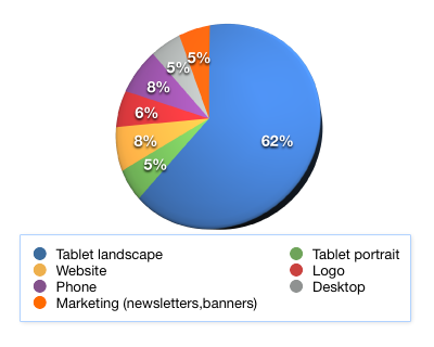
The most time was spent in the tablet because that's what we built first and it is at this moment 100% done. We expect to spend more time on other areas like desktop and phone but not as much as the tablet because we are reusing a lot of ideas.
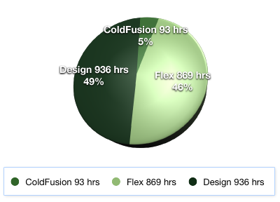
Pixel perfect vs Wireframe
This is interesting: we spent very little in wireframe for this project, only 7%, of the design time. I mentioned before that we had our reasons and I feel that we made the right choice.
![]()
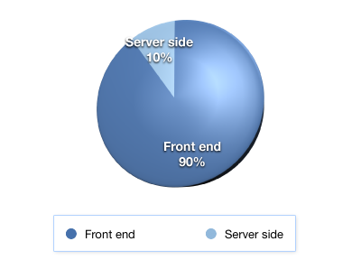
Sever side vs front end vs design
The server side is really nothing: only 5% of the whole project, and we are estimating that it will remain at the same ratio. We think that we'll need to spend more on the server side when we'll need to scale to more than one server, but for now we are not worrying too much. Flex, on the other hand, is taking much longer.
In this following chart we compare only development, between server side and UI development and the ratio is 10% vs 90%.
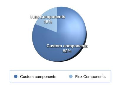
Flex break down
I did not talk much about Flex in this post, but let me tell you that we were very picky here as we were with the design. We built a lot of custom components. Here is the break down on Flex built-in components that we used and custom components that we built.
Conclusion
We had the idea for Conqu for long time. We even started it 3 years ago but we didn't give it the attention that it deserved. This time we approached it differently. We gave it full attention and a team of 3 people, with the same importance as any other client. This is not a project that we are doing between late nights and weekends, this is a full time project, and I feel that we did it right this time. A few other people also think the same.
I love this app! I've been searching for a simple, yet robust project/task management system and am so thankful to have found Conqu! It works great with BB PlayBook. You don't have to be well-versed in GTD to use it. I recommend checking out the website to see the new features coming soon (synchronization...YAY!). I highly recommend this awesome app!
The best part is that it is cool to work on our own ideas, not on client work. We can manage our time better, spending time were we feel that needs more work and moving quickly when we know what we want.
If you are thinking to start a new project I suggest that you do it, but don't do it half way, because your project will die in the middle. I also think it is better to delegate things that you are not capable of doing. For example, if you are a developer, try to hire a designer to help you. If you don't have the extra money, try to get a partner. If you need help with the server, you should hire someone to do that too. Of course you can do everything, but the quality of your product will be affected. Some are lucky and are both designer and devevelopers (devsigner), but they need more time to complete the whole thing so there is always a drawback.
And if you took the time to read it all please write a comment telling us what works for you. I'd love to know what things are working for others.