Mobile ItemRenderer in ActionScript (Part 5)
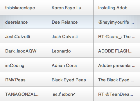
This is part 5 of my series on item renderers. As you may know, the Mobile Flex Framework does not have a DataGrid, mostly because a DataGrid control uses a lot of real state and the phone has a small screen. But, we have tablets too and a Grid makes complete sense. However, the regular flex DataGrid will not work as it is too heavy for that. We also want gestures and bouncing like the mobile List has. So the workaround is to make an ItemRenderer that mimics a grid.
This is part 5 of my series on item renderers. As you may know, the Mobile Flex Framework does not have a DataGrid, mostly because a DataGrid control uses a lot of real state and the phone has a small screen. But, we have tablets too and a Grid makes complete sense. However, the regular flex DataGrid will not work as it is too heavy for that. We also want gestures and bouncing like the mobile List has. So the workaround is to make an ItemRenderer that mimics a grid.
For this example I'm reusing the code of the Application from the previous Twitter example so I will not explain that. Also I'm reusing some of the pieces from the TweetRenderer but changing the layout a lot.
For reference, these are the previous posts: part 1, part 2, part 3 and part 4.
Styles
The main difference from the previous example is that I don't have individual styles for each TextField. Instead, all the fields use the same one. The new thing that I added is the vertical-grid-line-color property used to paint the vertical lines. renderers|TweetGridRenderer
renderers|TweetGridRenderer
{
	padding-left: 15;
	padding-right: 15;
	gap: 20;

	min-height: 50;
	vertical-grid-line-color:#aaaaaa;
	font-size: 15;
	color: #555555;
	font-family: _sans;
	separator: Embed(source='/styles/images/separator.png' );

	background: Embed(source='/styles/images/background_up.png',
		scaleGridLeft=10, scaleGridTop=20, scaleGridRight=11, scaleGridBottom=21 );
}

renderers|TweetGridRenderer:selected
{
	background: Embed(source='/styles/images/background_down.png',
		scaleGridLeft=50, scaleGridTop=20, scaleGridRight=51, scaleGridBottom=21 );
}
TweetGridRenderer
This class has some similar elements to the TweetRenderer. The main differences are:
- I added a lineCanvas display object used to paint the vertical lines.
- I use fix height instead of variable height. The height is set by reading the value from the CSS.
- I use the same styles for all the fields. Note that we do that when we call TextUtil.createSimpleTextField and pass "this".
- I changed the layout off all the fields and removed the avatar image.
package renderers
{
	import flash.display.DisplayObject;
	import flash.display.Graphics;
	import flash.display.Shape;
	import flash.text.TextField;
	import utils.TextUtil;
	public class TweetGridRenderer extends BaseRenderer
	{
		protected var userField:TextField;
		protected var nameField:TextField;
		protected var contentField:TextField;
		protected var background:DisplayObject;
		protected var backgroundClass:Class;
		protected var separator:DisplayObject;
		protected var lineCanvas:Shape;
		protected var columnWidth:int
		protected var paddingLeft:int;
		protected var paddingRight:int;
		protected var paddingBottom:int;
		protected var paddingTop:int;
		protected var gap:int;

		//  Contructor
		public function TweetGridRenderer()
		{
			percentWidth = 100;
		}

		//  Override Protected Methods
		override protected function createChildren():void
		{
			readStyles();
			setBackground();
			var separatorAsset:Class = getStyle( "separator" );
			if( separatorAsset )
			{
				separator = new separatorAsset();
				addChild( separator );
			}
			userField  = TextUtil.createSimpleTextField( this );
			addChild( userField );
			nameField  = TextUtil.createSimpleTextField( this )
			addChild( nameField );
			contentField  = TextUtil.createSimpleTextField( this );
			addChild( contentField );
			lineCanvas = new Shape();
			addChild( lineCanvas );
			// if the data is not null, set the text
			if( data )
				setValues();
		}
		override protected function updateDisplayList( unscaledWidth:Number, unscaledHeight:Number ):void
		{
			var oldColumnWidth:int = columnWidth;
			columnWidth = Math.floor( unscaledWidth / 3 );
			if( columnWidth != oldColumnWidth )
				setValues();
			var textWidth:int = columnWidth - paddingLeft - paddingRight;
			background.width = unscaledWidth;
			background.height = unscaledHeight;
			var textY:int = ( unscaledHeight - userField.textHeight ) / 2;
			userField.x = paddingLeft;
			userField.y = textY;
			TextUtil.adjustTextSize( userField, textWidth );
			nameField.x = columnWidth + paddingLeft;
			nameField.y = textY;
			TextUtil.adjustTextSize( nameField, textWidth );
			contentField.x = columnWidth * 2 + paddingLeft;
			contentField.y = textY;
			TextUtil.adjustTextSize( contentField, textWidth );
			separator.width = unscaledWidth;
			separator.y = layoutHeight - separator.height;
			var g:Graphics = lineCanvas.graphics;
			g.clear();
			g.lineStyle( 1, getStyle( "verticalGridLineColor" ) );
			g.moveTo( columnWidth, 0 );
			g.lineTo( columnWidth, unscaledHeight );
			g.moveTo( columnWidth * 2, 0 );
			g.lineTo( columnWidth * 2, unscaledHeight );
		}
		override protected function measure():void
		{
			measuredHeight = getStyle( "minHeight" );
		}
		protected function setBackground():void
		{
			var backgroundAsset:Class = getStyle( "background" );
			if( backgroundAsset && backgroundClass != backgroundAsset )
			{
				if( background && contains( background ) )
					removeChild( background );
				backgroundClass = backgroundAsset;
				background = new backgroundAsset();
				addChildAt( background, 0 );
				if( layoutHeight && layoutWidth )
				{
					background.width = layoutWidth;
					background.height = layoutHeight;
				}
			}
		}
		override protected function setValues():void
		{
			var arr:Array = String( data.author.name ).split("(");
			var user:String = String( data.author.name )
			userField.text = arr[0];
			nameField.text =  String( arr[ 1 ] ).replace( ")", "" );
			contentField.htmlText = data.content.value;
		}
		override protected function updateSkin():void
		{
			currentCSSState = ( selected ) ? "selected" : "up";
			setBackground();
		}
		protected function readStyles():void
		{
			paddingLeft = getStyle( "paddingLeft" );
			paddingRight = getStyle( "paddingRight" );
			gap = getStyle( "gap" );
		}
	}
}
As you can see this renderer is very similar to the one on our previous example. By making just some adjustments we have a completely new layout. Hope you enjoyed this series on item Renderers.